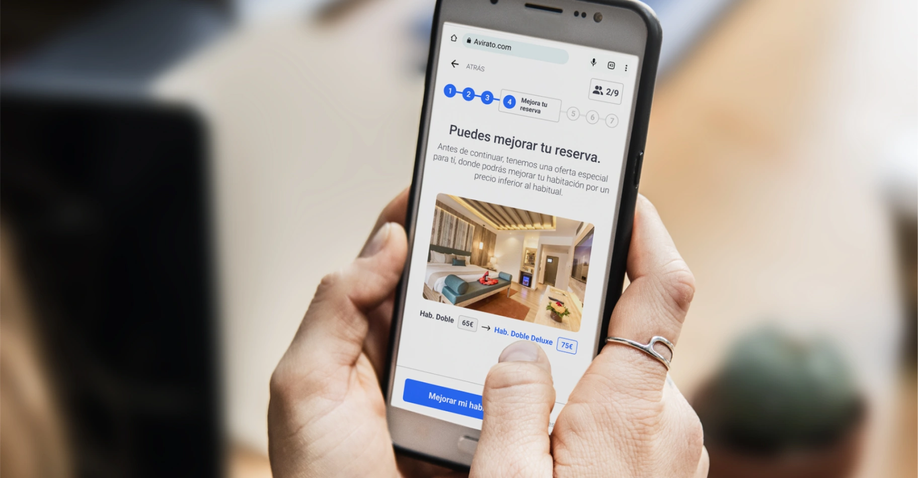
This project focuses on the development of a web app optimized for mobile, targeting online check-in within the hotel industry, associated with a PMS SaaS software. The primary objective is to provide a solution for guests to complete their check-in prior to arriving at the hotel, with the option of performing upsells and purchasing extras before their arrival.
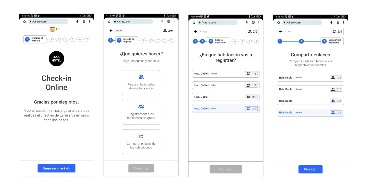
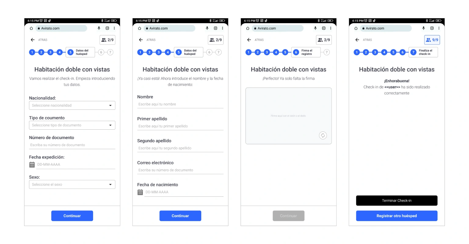
The redesign and enhancement of the graphic interface for the "Check in online" process for hotels has been an exhilarating and challenging project. Our primary mission was to relocate and adapt elements to be more intuitive, as well as integrating marketing and UX/UI tools to enable an appealing and straightforward check-in experience. We aimed to simplify the user's registration process, adding upselling options and extras purchases, while ensuring the privacy and security of their data.
The previous design of the check-in system posed issues. On-screen elements were not intuitively organized, leading to confusions and delays in the process. Furthermore, the lack of additional purchase options and room sharing limited revenue opportunities and user experience.
The challenge lay in designing an interface that was not only aesthetically pleasing but also simplified the check-in process and added positive emotions to the experience. We wanted guests to feel they had total control over their reservation and, at the same time, be enticed to enhance their stay through our additional options.
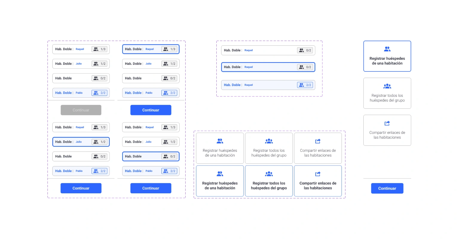
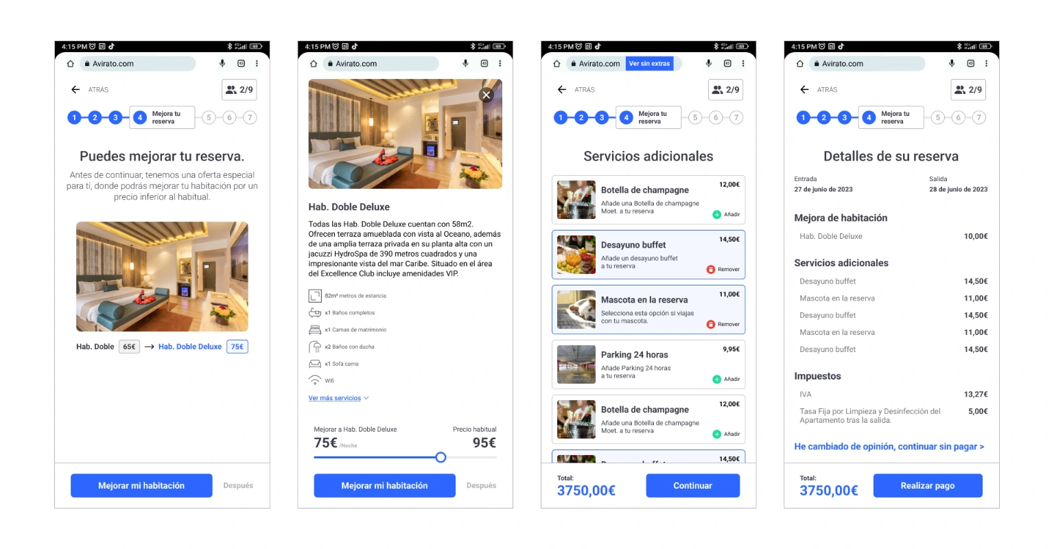
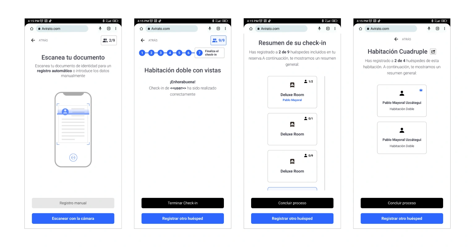
We revamped the interface, implementing a more fresh and modern graphic design, yet keeping it simple and attractive. Moreover, we introduced an upselling option and extras purchase, which not only enhances the customer experience but also boosts hotel revenues. The addition of functionalities, such as sharing rooms from a master booking and improvements in data privacy, strengthens user trust in our platform.
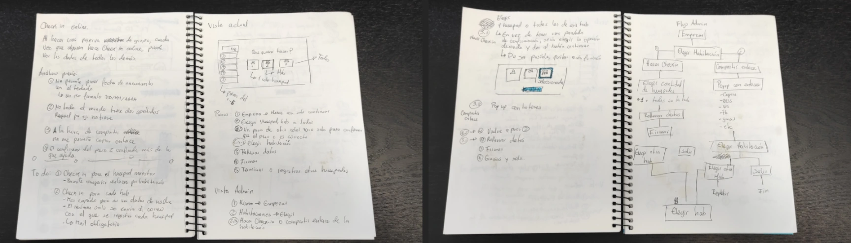
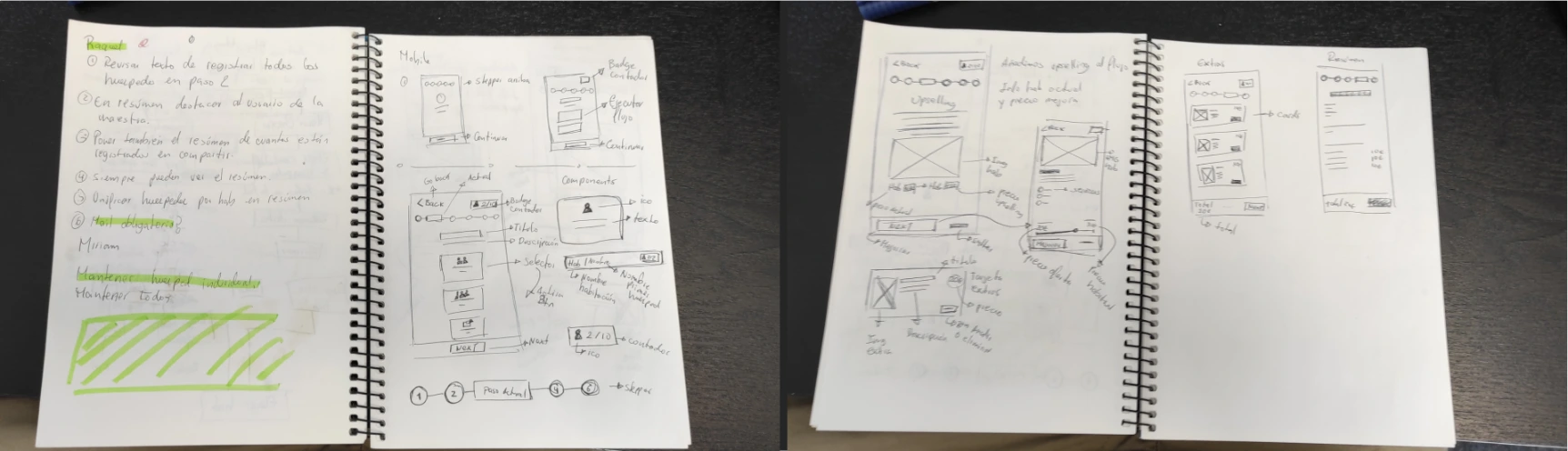
The reinvention of the "Check in online" interface was a meticulous and research-based process. We started with a deep dive into the hotel sector, studying emerging UX/UI trends, and analyzing leading applications in the market to identify best practices. This initial phase not only provided us with a clear understanding of the current landscape but also highlighted areas where our design could excel.
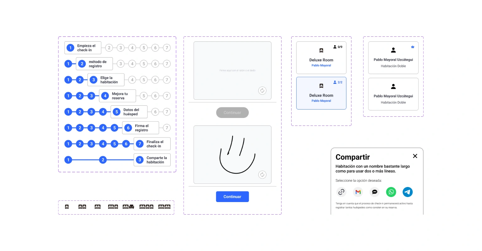
Next, we organized multiple brainstorming sessions with a multidisciplinary team, including designers, engineers, and marketing experts. These sessions were pivotal in conceiving new features and refining the application's aesthetic direction. Multiple wireframes and prototypes were designed and built, serving as tangible models to visualize the proposed enhancements and initiate functionality testing.
The introduction of features, such as upselling and room sharing options, stemmed from a detailed analysis of how to add value to the customer's experience while maximizing revenues for hotels. These additions underwent rigorous testing, ensuring their seamless and effective implementation.
To ensure our application was not only functional but also highly intuitive, we turned to the valuable input of model users. We selected a diverse group, spanning a range of ages, technological familiarity, and travel frequency, to ensure a broad perspective.
During the interview sessions, these users interacted with previous versions of the check-in system, and their reactions and comments were meticulously recorded. We noticed recurring issues, like difficulty in understanding certain process flows and a demand for greater personalization during check-in.
But our focus wasn't solely on areas of improvement. We also identified what users genuinely appreciated and sought ways to enhance those aspects in the revamped version. Feedback sessions with these model users were essential to refining the prototypes, bringing them closer to a final solution meeting user needs.
Once the improvements were implemented, we invited users again to test the new interface. The positive feedback and reduction in friction points were indicative of a successful, user-centric design. These insights helped us provide an optimized, efficient, and, above all, pleasant check-in experience.
After several iterations, we introduced an improved "Check in online" application, boasting a contemporary aesthetic and superior functionality. The new features and refreshed design have enhanced user experience, translating into faster registrations and increased sales of additional services.
Ready to take your online presence to the next level? Contact us today for a personalized quote.
Fill out our form and let's start working together!