
In this project, we worked with a company dedicated to the hotel industry that offers a property management software (PMS) to hotels of different sizes. The company needed to renovate the user interface (UI) of its modules to adapt to current market needs and improve the user experience.
Although the company has a modern vision, its target audience are more traditional hotels that require a solid and reliable platform to manage their properties. The design team faced the challenge of creating an interface that was attractive and easy to use, while also maintaining the functionality and stability that customers need.

Redesigning a hotel planning system has been one of the most exciting projects we've worked on at MayoralVen. We were tasked with creating an interface that would allow users to review their reservations quickly and easily, while also providing an aesthetic approach that wouldn't strain their eyes after hours of use. The previous interface had a dated graphical user interface (GUI) that handled a lot of information, presenting usability and aesthetic problems that needed to be solved to provide a satisfactory user experience.
The problem was that the old interface had many usability and aesthetic errors that affected the user experience. Users needed a more agile and user-friendly interface to review their reservations continuously without any problems. The amount of information presented on a single module's screen was too much, making it difficult to identify reservations and make quick decisions. Therefore, the main objective was to solve these problems and improve the interface's usability.
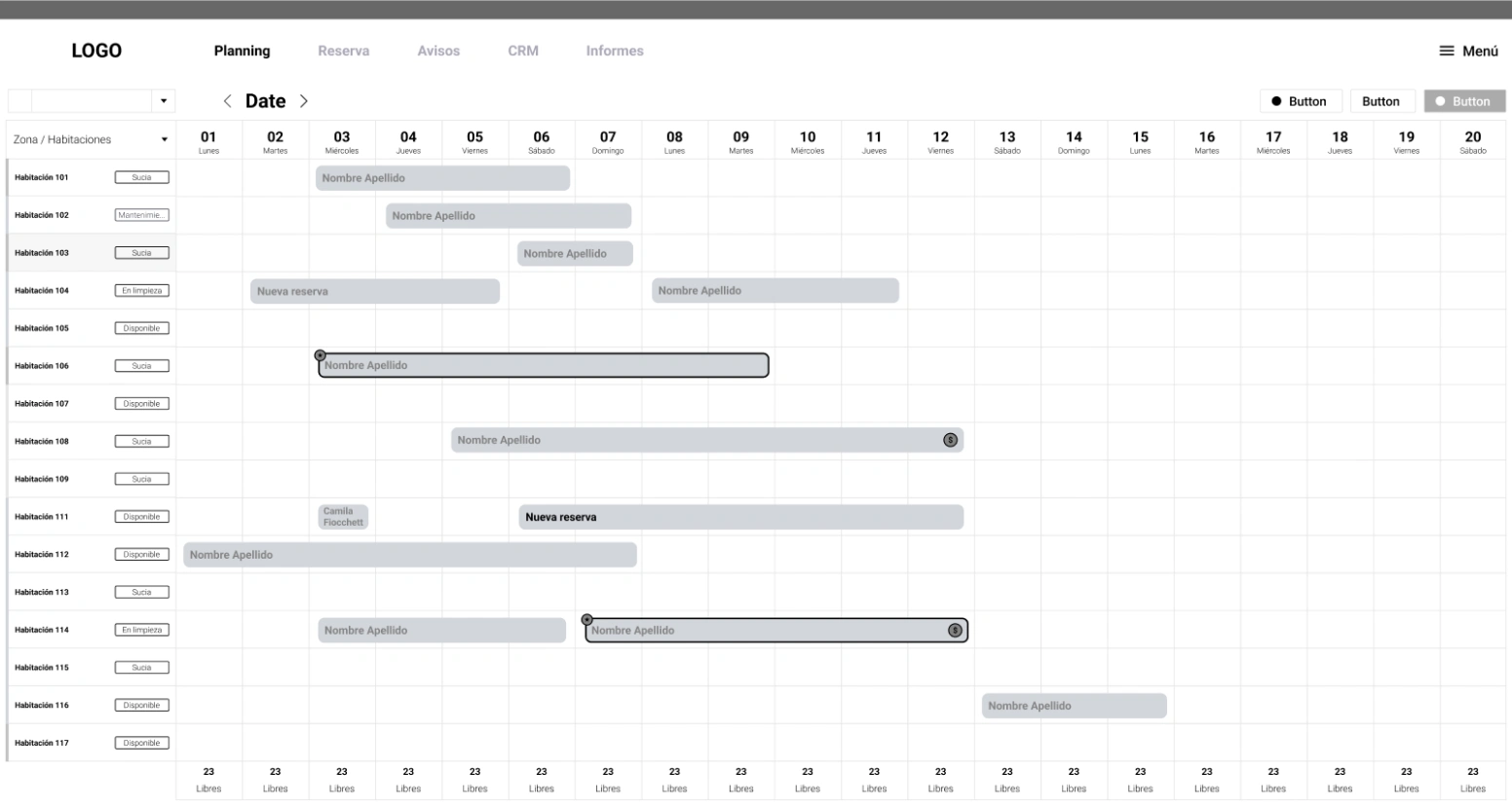
The challenge presented to us was to create an interface that was clean, intuitive, and easy to use, allowing users to review their reservations easily while dealing with the complexity of having hundreds of reservations in a single module. To solve this challenge, we worked on designing a modern interface that would allow handling the amount of information in an organized and simple way, while also having an appealing appearance for the user. We also considered the number of hours the user spends in front of the screen, so it was important that the interface wasn't visually straining.
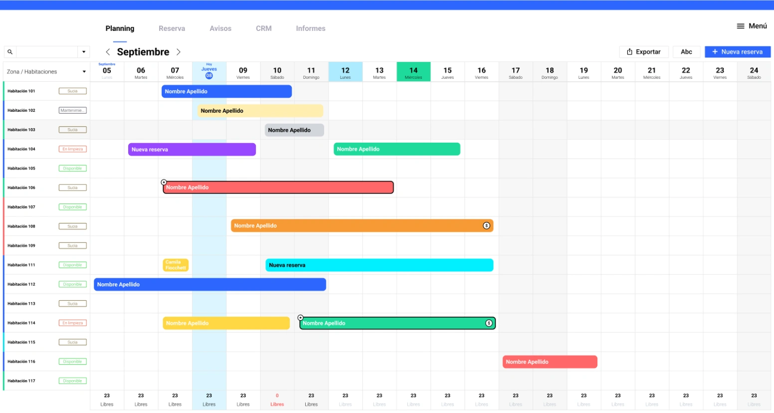
The solution was a clean, intuitive, and modern system that allowed us to solve the usability and aesthetic problems of the old interface. We created a day and night mode interface that allowed users to adapt their viewing preferences. Additionally, we worked on creating a clear and organized information architecture that would allow handling the amount of information easily and neatly. The interface is very intuitive, making it easier to manage information and make decisions. In summary, the interface redesign improved the user experience by allowing them to handle information more efficiently and comfortably.
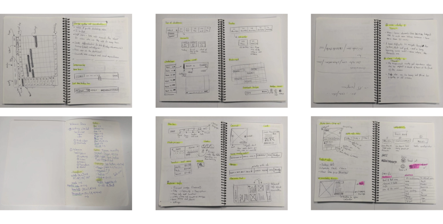
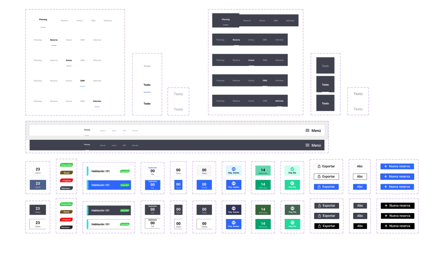
The development of the UI system for this project was a crucial step in creating a strong and recognizable identity for the hotel management software. The idea was to create a consistent visual system that would integrate across the over 100 modules that make up the software, to provide a unique and cohesive user experience across all areas of the PMS.
To achieve this goal, the design team worked on creating a library of modular components and visual styles that could be adapted to the specific needs of each module of the software. Clear and consistent design criteria were implemented to guide the selection of typography, colors, iconography, and interaction patterns.
The aim was not only to create an attractive and modern aesthetic, but also to improve the usability of the software. A clear visual hierarchy and intuitive navigation structure were sought to facilitate users' interaction with the system. Additionally, an icon system was developed to help users quickly identify the different elements and functions of the software.
To develop an effective UI/UX design solution for the hotel reservation system redesign project, a study was conducted on over 20 user models. This analysis allowed for the identification of the system's strengths and the problems users faced in their experience of use. Among the highlighted problems were the amount of information presented on the screen, making it difficult to read and analyze; visual fatigue caused by long hours of system use; an outdated interface that made navigation and daily operations difficult; and the effort required to carry out everyday actions.
To address these issues, a user-centered design solution was adopted, focusing on improving the system's usability and aesthetics. A modern and clean graphical interface design was implemented to provide easy and efficient navigation for users. In addition, a relaxing color palette and an adaptable lighting system were incorporated to reduce visual fatigue and provide a comfortable and enjoyable user experience.
In summary, the user study identified users' problems and needs, allowing for the development of a more intuitive, attractive, and functional hotel reservation system.

After extensive research and design work, the team was able to create a new user interface that is more intuitive, easy to use, and has a modern visual style. The company's visual identity has been integrated into the new design, creating a consistent and solid user experience. The final result was a hotel reservation management system that significantly improves usability and aesthetics, making it more attractive to users and more competitive in the market.



Ready to take your online presence to the next level? Contact us today for a personalized quote.
Fill out our form and let's start working together!