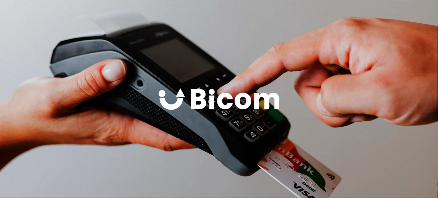
Bicom was born out of the growing need to introduce computer and technological systems into businesses. With the significant growth of the internet, APIs, and technology, Bicom emerges as a company that helps B2B clients grow with innovative checkout, payment, and shopping cart systems, allowing them to focus solely on selling their business products.
Bicom wants to change its image, as they feel that what currently exists no longer fits them. They want to go a step further, to show that they are up-to-date, just like their products.
They felt that the characteristic graphic elements of their company no longer fit with the brand tone, their slogan, the product they want to sell, and above all, how they want to sell it.
We placed a lot of emphasis on enhancing the brand values, combining in a not-too-complex icon that evokes emotions, two very important things.
1.-Bicom's attitude towards its customers, how they want to show it.
2.-Their objective, both theirs and their customers'.


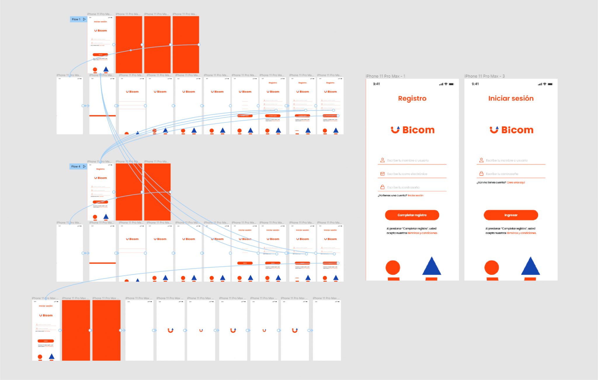
Bicom needed basic login and registration design for a mobile app version of their POS system. While this was a basic task, we were also asked to develop the prototype for the interaction and animation within this small group of elements. This would be a sample of the prototyping and interaction within Figma.
For this section, we want to talk about a very particular handicap we've had. The industry is dominated by a predominant dark blue color that directly references technology.
It has been made clear to us from the very beginning that it was essential for the brand to work with this color, just like its competitors.
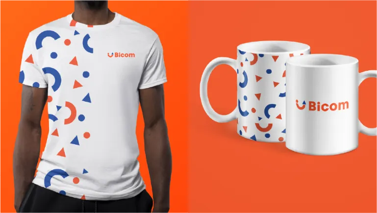
To turn this around, we have decided to use this blue as a secondary and support color, accompanied by what will be the main color, as a direct complementary color to blue and orange, allowing us to stand out and differentiate ourselves from others in a crowded working area with the same typology of color.
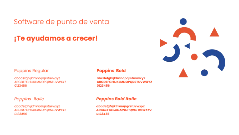
e have worked with a sober, sans-serif font that allows us to use it for any occasion and to convey any message technically, more personally and directly.

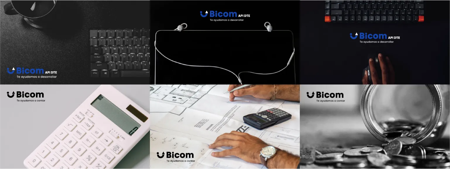
Bicom offered many services, so we decided to work with different color tones for each section that is worked on and breathed within the brand, allowing for isolated recognition and, at the same time, as a whole, what the project in question that each new client requests is about.
We have also separated and unified the brand's tone of voice with a slogan adapted to each sub-brand, to begin creating a strong and coherent system so that the sub-brands can function separately but belonging to the same ecosystem.


For the creation of the unitary graphic system, all graphic elements such as images, shapes, photographs, etc. aim to evoke in a direct or indirect way, verticality or ascendance, with objects pointing upwards, people at heights, main objects located in the upper part, etc.


They were working with a quite basic website, with clear layout problems. Due to the rush, they tried to change it quickly without good results, so they have requested our help to continue creating and feeding the graphic ecosystem and tone of voice of the brand, also through the graphic expression on their website.
The app, on the other hand, is quite simpler, it has a small registration module, login, load, main, and a small internal store as a test bot since it is exclusively for their clients to easily simulate things like price changes, ups and downs of items and products, etc., without directly affecting their store.
It also serves as a testing and modeling platform for possible future clients who are not yet part of Bicom.

In general terms, this is Bicom. Thank you for reading and being here!
Ready to take your online presence to the next level? Contact us today for a personalized quote.
Fill out our form and let's start working together!